Tension Loops for Data Presentations
Read Time: 7 Minutes
You spend hours preparing a data presentation. You organize the slides, double-check the numbers, rehearse your talking points. Then you deliver it and watch your audience mentally leave the room by slide three.
The data is solid. The problem is the structure.
Most people present data like a textbook: here are the facts, here’s my conclusion, any questions? It’s clear, logical, and completely forgettable.
A few months ago, I found a report that does the opposite. A Sky News segment on Venezuela went viral with 5 million views.
The US had just seized Maduro, and this reporter had predicted exactly why months earlier. Not through political commentary, but through seven minutes of oil production data, refinery statistics, and import charts.
Dense, dry stuff. And people couldn’t stop watching. The reporter used a structure I call a tension loop — three moves that turn flat data into something your audience actually leans into.
Setup, Tension, Resolution
Here’s how a tension loop works.
Setup. You state what your audience currently believes. Their assumption. What they think they already know.
Tension. You challenge that assumption with data that contradicts it. Now there’s a gap between what they believed and what’s true, and their brain needs it filled.
Resolution. You fill the gap with new understanding.
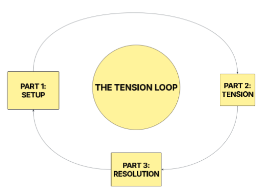 The three-part structure behind every compelling data presentation.
Three parts. Let me show you how the reporter used this to make oil refinery data feel like a thriller.
The Loop That Made 5 Million People Care About Oil Types
Quick context: the whole report builds toward one question. Trump says US interest in Venezuela is about drugs. The reporter thinks it’s about oil.
But to prove that, he needs the audience to understand something they’ve never thought about. Here’s roughly what he says about two minutes in:
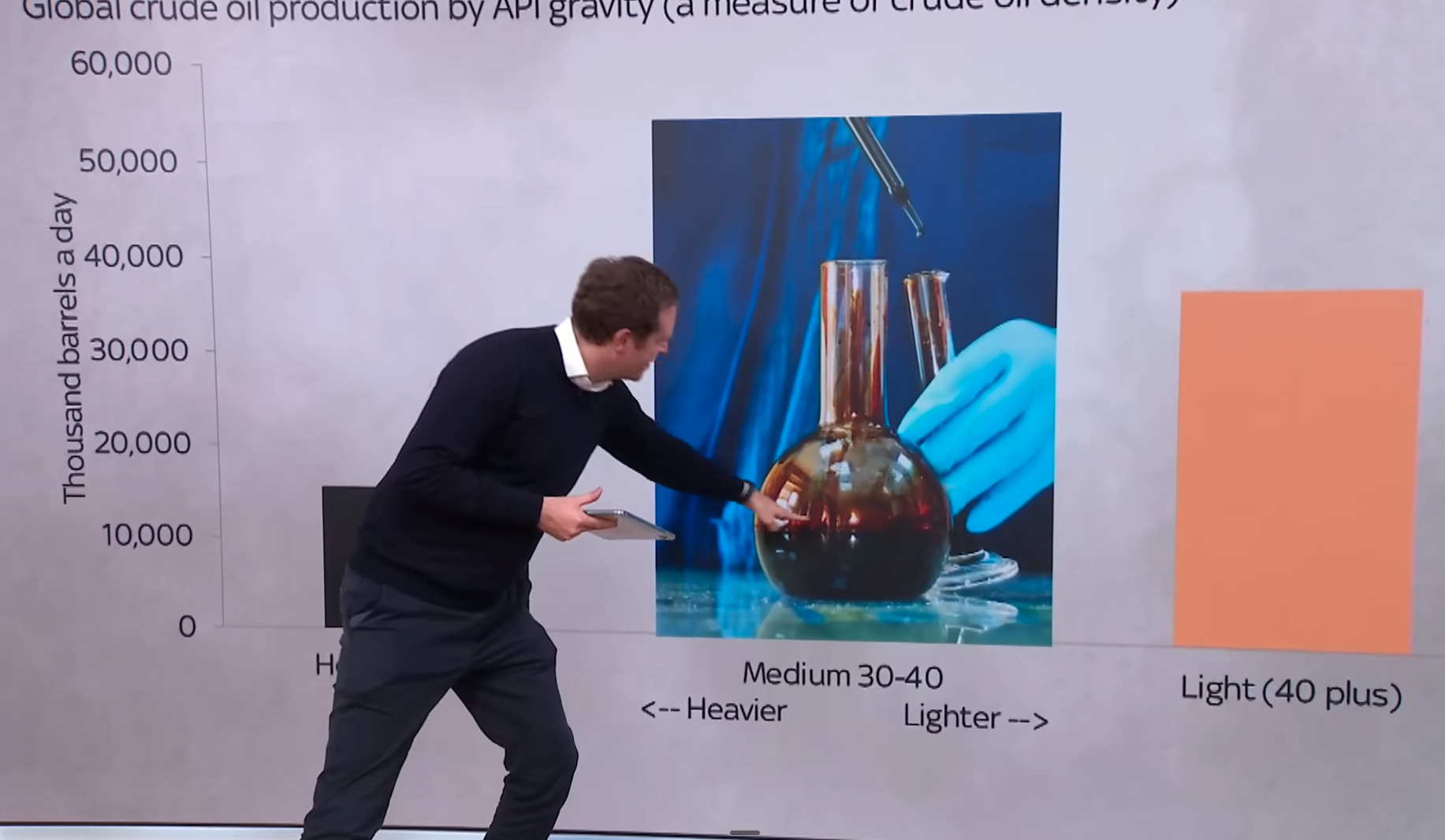
“When you’re thinking about crude oil, maybe you’re just thinking about barrels of oil — it’s all the same, isn’t it? Well, actually, no. There’s light crude, medium crude, and heavy crude. They look completely different.”
He goes on to show that American refineries were specifically built to process heavy crude. But all the oil America produces from fracking? It’s light crude. Wrong type entirely.
Now trace the loop.
Setup: “Barrels of oil — it’s all the same, isn’t it?” He’s naming what everyone assumes. Oil is oil.
Tension: “Well, actually, no.” Your brain goes: wait, there are different kinds? Now you need to know why that matters.
Resolution: America’s refineries need heavy crude, but America only produces light. The country that leads the world in oil production can’t actually fuel its own refineries with what it produces.
 The moment the reporter reveals the mismatch between what America produces and what its refineries need.
That last fact changes how you see everything else. Once you know America depends on imported heavy crude, the question of who has it becomes urgent.
And that’s exactly where the reporter goes next — all the way to Venezuela sitting on the largest heavy crude reserves on the planet.
One loop. Maybe 90 seconds of screen time. The audience learned something they’ll remember because they felt the gap before they got the answer.
Why Leading With Answers Kills Your Presentation
Most presenters would handle that same information like this:
“There are three types of crude oil: light, medium, and heavy. American refineries process heavy crude. American shale production is primarily light crude. This creates a supply mismatch.”
Same facts. Completely different effect.
The first version makes you curious before it teaches you. The second hands you information you didn’t ask for.
When you state the assumption first, the audience nods along. They’re comfortable. Then the contradiction lands and their brain lights up — they want the resolution.
When you lead with the answer, there’s no gap, no tension, and no reason to keep paying attention.
How to Use This in Your Next Presentation
Pick one data point from your next presentation. The one you really need people to remember. Then build a tension loop around it.
First, name the assumption. What does your audience currently believe? What would they guess if you asked them?
Say you’re presenting on why the engineering team keeps missing deadlines. The assumption in the room is probably that the team is understaffed. That’s what leadership has been saying for months.
Second, create the gap. Challenge the assumption with a data point that doesn’t fit. Don’t explain it yet.
“In the last two quarters, we added six engineers. Velocity went down, not up. We shipped fewer features in Q4 than Q3.”
Now the room has a question. If headcount isn’t the problem, what is?
Third, fill the gap. This is where your actual insight lives.
“It’s onboarding and context-switching. New engineers spend their first 8 weeks asking questions that pull senior engineers off their work. We don’t have a staffing problem. We have a ramp-up problem, and every new hire makes it temporarily worse.”
Same data you would have presented anyway. But now the audience felt the problem before they heard the solution. That insight will stick.
The Sky News reporter used this structure six times in seven minutes, stacking loops until the final reveal hit like a freight train. I broke down every single one in a recent YouTube video — watch the full breakdown here if you want to see how tension loops compound across an entire presentation.
But you don’t need six loops. You need one. Name the assumption, challenge it, resolve it. Your audience will remember that moment long after they forget the rest of your slides.
Preston
Whenever you’re ready, here are some (free) resources you can check out:
- 7-Day Speaking Course — Daily exercises to build speaking confidence in one week.
- Knowledge Base Guide — Build a personal knowledge base that makes your thinking sharper and your writing faster.
- Newsletter Prompt Playbook — AI prompts and workflows I use to write my weekly newsletter in half the time.
Get free weekly communication tips
Actionable speaking and writing advice every Tuesday.
You're in. First email lands shortly.